


Colour comes from the earth beneath our feet. Already in pre-historic times, man used the ochres and black manganese of the land, along with charcoal and red chalk, to paint frescos across the walls of the caves he inhabited. Later, he would use milk of lime to whitewash the walls of his home, together with a whole host of renderings, pigments, dyes, paints and colourings…
Colour and Architecture
As for the complex history of the bonds between colour and architecture, the subject of our musings here, they go no further back than the beginning of the twentieth century. Rejection of ornament in architecture was followed by a reappraisal of the question of colour, and the advent of the Modern Movement threw architects into two camps. On one side were those in favour of colour in its most audacious expression and, on the other, advocates of an architecture that was pure and white 1.
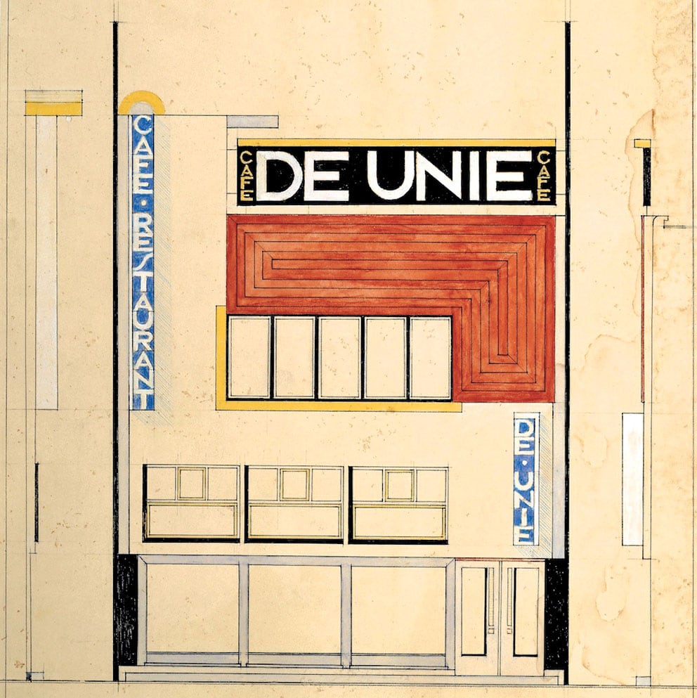
J.-P.-P. Oud, Café De Unie,
Rotterdam, 1925, DR
©
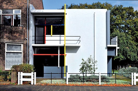
Gerrit Rietveld, maison Rietveld-
Shröder, 1924, DR
©
Bruno Taut, Hufeisensiedlung (1925 –1933), variations de couleur des entrées, 2013
©
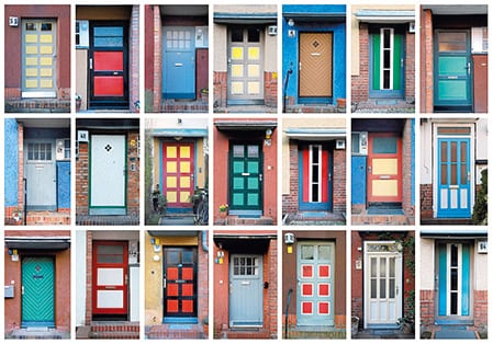
Bruno Taut, Hufeisensiedlung
(1925 –1933), variations de couleur
des entrées, 2013
©
Architect Bruno Taut was a pioneer of the former school of thought.
In the years following 1910, he argued that colour was an effective means of improving the city-dweller’s everyday existence. ‘We do not want to build any more joyless houses, or see them built…’ he writes.
‘Colour is not expensive like moulded decorations and sculptures, but colour means a joyful existence. As it can be provided with limited resources, we should, in the present time of need, particularly urge its use on all buildings which must now be constructed.’ Taut called for strong colours to be used, like red, green, reddish-brown or purple and, in this vein, was commissioned to design the first vibrantly coloured garden city, Falkenberg, in Berlin. The facades of the long rows of terraced houses are painted red, olive green, brownish yellow and glossy white, thereby individualising each building and, according to Taut, helping the inhabitants feel more quickly at home.
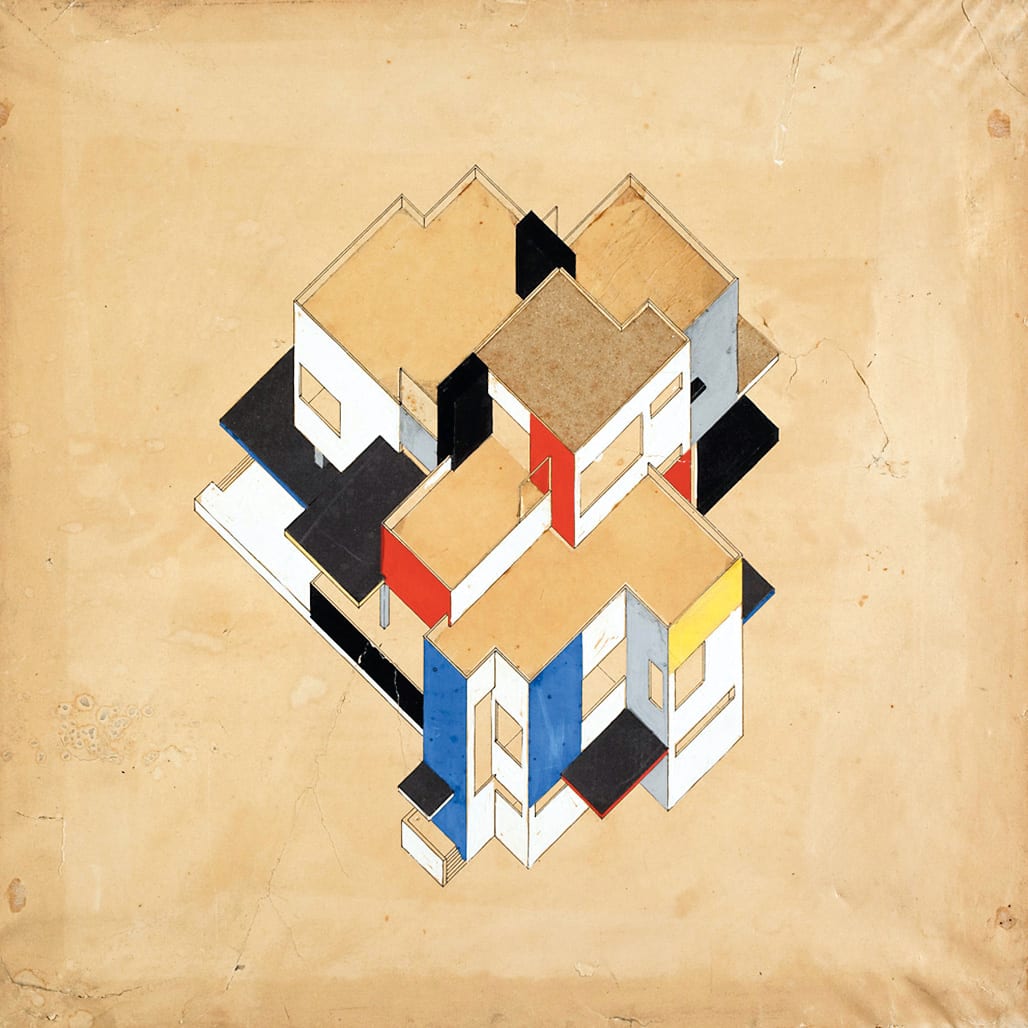
Other staunch supporters of the use of colour in architecture were the Dutch architects and painters of De Stijl, Piet Mondrian, Gerrit Rietveld, J.-J.-P. Oud and Theo van Doesburg. They used colour in delicate touches or generous swathes, both inside houses and on their exterior façades, as a means of equating the synthetic plastic processes at work in painting and architecture alike.
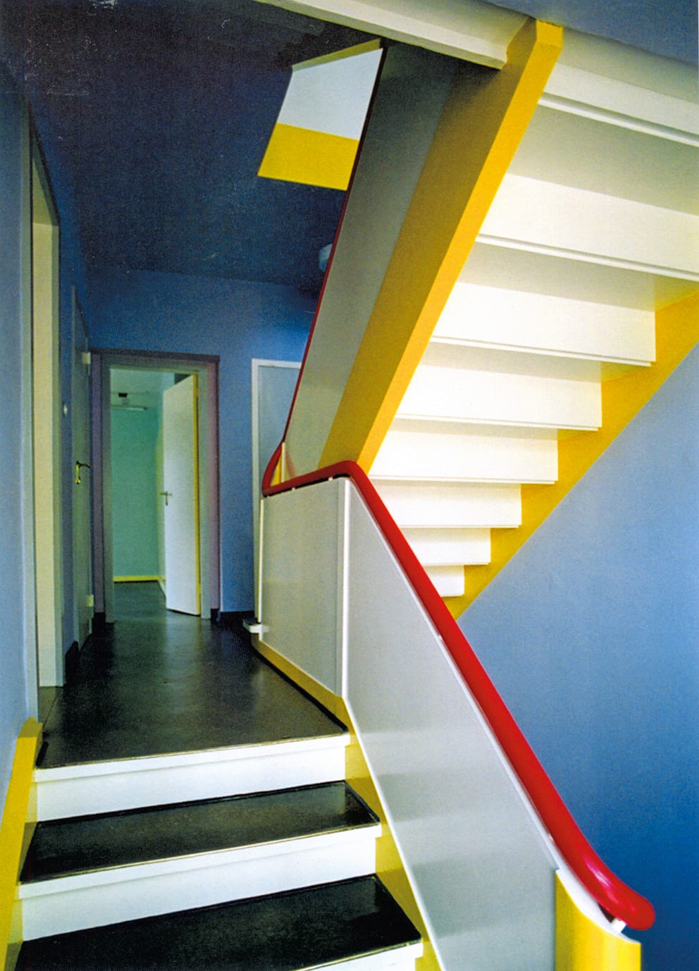
At the Bauhaus, Walter Gropius opposed colour to the notion of ‘pure white’ as an expression of social utopia. The outside of a house should, he thought, be almost exclusively white, while the interior could play on a variation of colours. As opinion and practice differed widely among teachers at the School, the Bauhaus made surprisingly little contribution to contemporary debate on the question of colour in architecture.
Theo van Doesburg,
Cornelis van Eesteren,
maison particulière,
projection axonométrique,
1923, DR
©
Walter Gropius, Vassily Kandinsky, cage d’escalier dans une maison de maître au Bauhaus, Dessau, 1926, DR
©
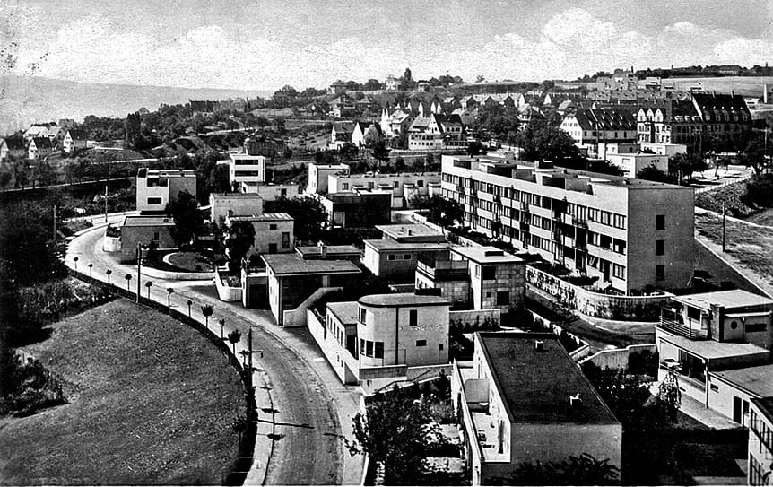
Along with the new precedence given to colour, an idea emerged that truly New architecture must be white, an idea which gradually gained ground and imposed itself with the Weissenhof exhibition held in 1927 in Stuttgart, and for which a full set of houses was built by seventeen architects from the European avant-garde, under the artistic direction of Mies van der Rohe 2.
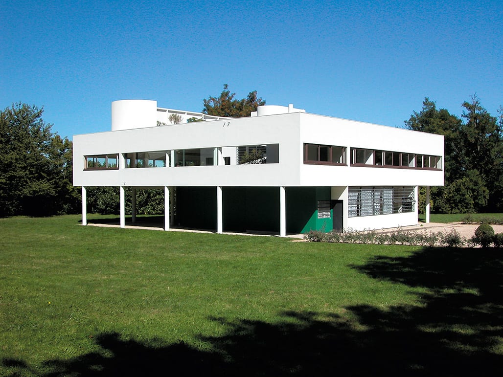
Le Corbusier’s white period (Villa Savoye), Mies van der Rohe’s Villa Tughendhat and Loos’s houses all reflect this trend. Yet it was undoubtedly Henry-Russell Hitchcock and Philip Johnson who most eloquently imposed the equation White = Modern voiced by International Style at the Modern Architecture exhibition held at the MoMa in New York in 1932. In the catalogue to the exhibition, they write, ‘Also in the use of colour the general rule is restraint. […] The earlier use of bright color had value in attracting attention to the new style, but it could not long remain pleasing. It ceased to startle and began to bore; its mechanical sharpness and freshness became rapidly tawdry. If architecture is not to resemble billboards, color should be technically and psychologically permanent.’ 3
Le Corbusier, villa Savoye, Passy, 1928 –1931, DR
©
Weissenhofsiedlung, Stuttgart, 1927, DR
©
Mies van der Rohe,
villa Tughendhat,
Brno, 1930, DR
©
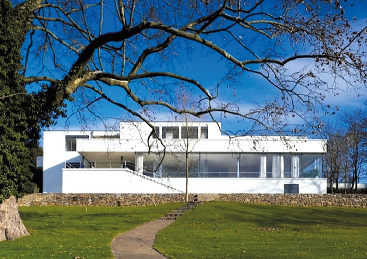
Mies van der Rohe is commonly considered to be colour’s most staunch opponent, as if the diktat of ‘white modernity’ stemmed from him and him alone. Yet the reality of the situation is undeniably more complex—there is nothing ‘pure white’ about the German pavilion he designed for the International Exhibition in Barcelona of 1929, in which glass, steel and no less than four different types of coloured stone (travertine from Rome, green marble from the Alps, green marble from Greece and golden onyx from the Atlas) bathe the building in colour.
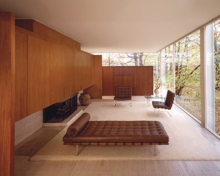
Nor is there anything pristine about Farnsworth House (1946–1951), built in glass and steel as an icon of Modern architecture. That would be forgetting the colour introduced by the two slabs of wood inside the building. Mies van der Rohe used white as a means of preserving the full strength of his materials, in a way reminiscent of the ‘organic’ school of architecture encapsulated in the work of Frank Lloyd Wright, in which the materials are allowed to freely voice their inherent nature, an idea widely revisited in architecture today
Mies van der Rohe, pavillon allemand, Barcelone, 1929, DR
©
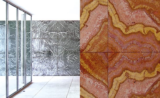
Mies van der Rohe, pavillon allemand, Barcelone, 1929, DR
©
Having first supported the idea that Modern architecture should be white, Le Corbusier also went on to nuance his ideas. ‘The interior of the house should be white’, he wrote of the Villa Laroche, ‘but for this whiteness to be appreciated, it must be set off by the use of a well-regulated palette of colours.’ 4
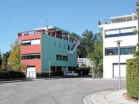
As for the ‘Quartiers Modernes Frugès’ housing development built in Pessac (1923-1925), he speaks in terms of ‘an entirely new conception of polychromy, at the service of a clearly architectural objective, that of shaping space through the very physics of colour, bringing certain volumes to the forefront while effacing others, in other words, designing buildings through colour, as we have hitherto done so with shapes. This is how architecture shall come to be a part of urban design.’ In 1931, Le Corbusier was working on a collection of wall coverings for a company based in Basel called Salubra, and colour was top on his agenda. ‘We will call upon the painters to make any wall standing in our way disappear. Architectural polychromy will possess the wall entirely, endowing it with the power of blood, the freshness of the meadow, the brilliance of the sun or the depth of the sea or sky. Its power is boundless! If a wall is blue, it fades into the distance; if it is red, it stands its ground… Architectural polychromy does not kill the wall, but has the power to move or remove it, to class volumes according to importance. With polychromy, the skilful architect has before him an endless bounty of resources. Polychromy belongs to the great living architecture of today and tomorrow. […] Polychromy is an architectural technique as powerful as the ground plan or section. Better than that, polychromy is itself an element of the plan and section.’
Le Corbusier, quartiers modernes Frugès, Pessac, 1923 –1926, DR
©
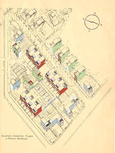
Le Corbusier, quartiers modernes Frugès, Pessac, 1923 –1926, DR
©
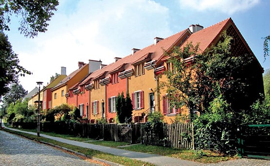
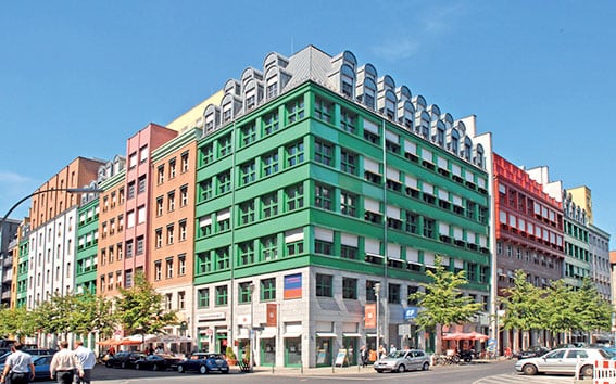
In the wake of the Second World War, Europe was faced with a vast reconstruction crisis. Raw concrete was often used and the debate on colour was set aside. In the 1950s, a certain form of international architecture was prevalent to the point of excess, and became the butt of post-modernist criticism in the mid-1960s. This gave way to a revival of past forms (with columns, pediments etc.), marking a difference with the minimalist simplicity of International Style through the use of colour, as illustrated by the Schützenstrasse district built by Aldo Rossi in Berlin (1994–1998).
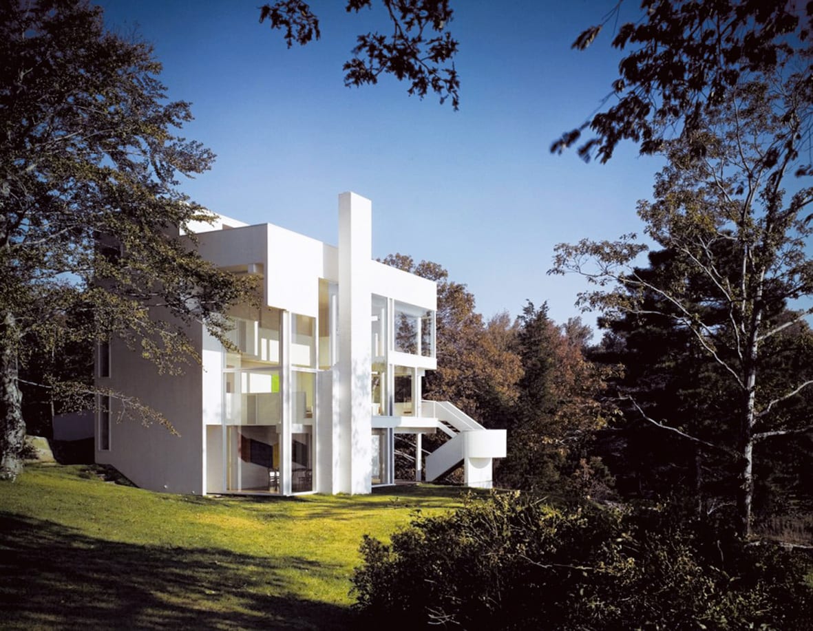
From Disney to Dubai, kitsch is never far away… and yet, white continues to stand the test of time. Some architects, like Richard Meier, have made it their hallmark. Photos of Meier’s first designs (Smith House, 1967, Douglas House, 1973) highlight the startling contrast between the pristine white walls and surrounding natural environment. Meier is resolute to the last and even his most recent buildings are unambiguously white.
Richard Meier, Smith house, 1967, DR
©
Aldo Rossi, quartier Schützenstrasse,
Berlin, 1994 –1998, DR
©
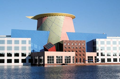
Arata Isozaki, Immeuble Disney, Orlando, Floride, 1990, DR
©
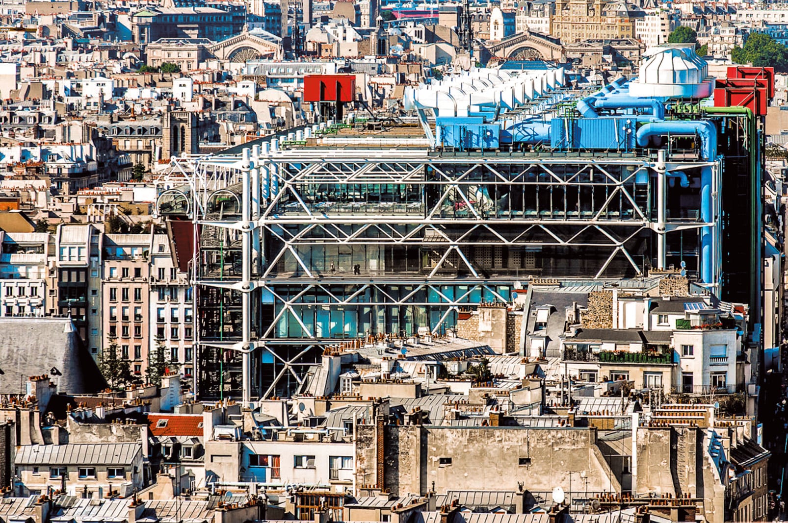
In 1977, when the Centre Georges Pompidou was built, with its internal skeleton and brightly coloured innards of pipes, tubes and ducts splashed across its facade for all to see, it cut a lonely figure against the grey backdrop of Parisian rooftops. It triggered a furore the vehemence of which would be difficult to imagine today—Our Lady of Plumbing, Pompidoleum, art warehouse, gasworks, oil refinery, avant-garde blot on the landscape… there was no lack of ironical epithets. While it was the architects’ decision to reveal the normally hidden inner workings of the building which attracted the most criticism, the bright colours used to draw attention to this choice were feverishly decried. Few people know that the initial design used a harmonious union of brown and light blue, the colours of the earth and sky. It was only when a counter-proposition set forward by artist Jean Dewasne won over architects Renzo Piano and Richard Rogers that bright colours were integrated into the final mock-up for the building presented in 1973 5. The colours are most clearly visible across the building’s east façade, enabling the onlooker to identify the different function of each ‘pipe’—green for water, blue for air, yellow for electricity and red for the lifts, freight hoists and escalators.
Renzo Piano, Richard Rogers, Centre Georges Pompidou, Paris 1977
©
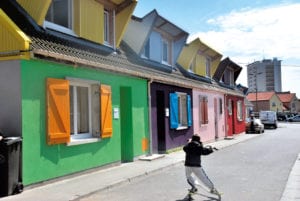
In recent years, Patrick Bouchain has revisited ideas first put into practice by Bruno Taut, as part of a project to renovate 60 council houses in partnership with their inhabitants in Boulogne-sur-Mer. 6
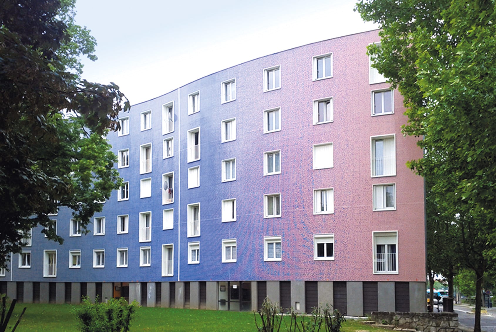
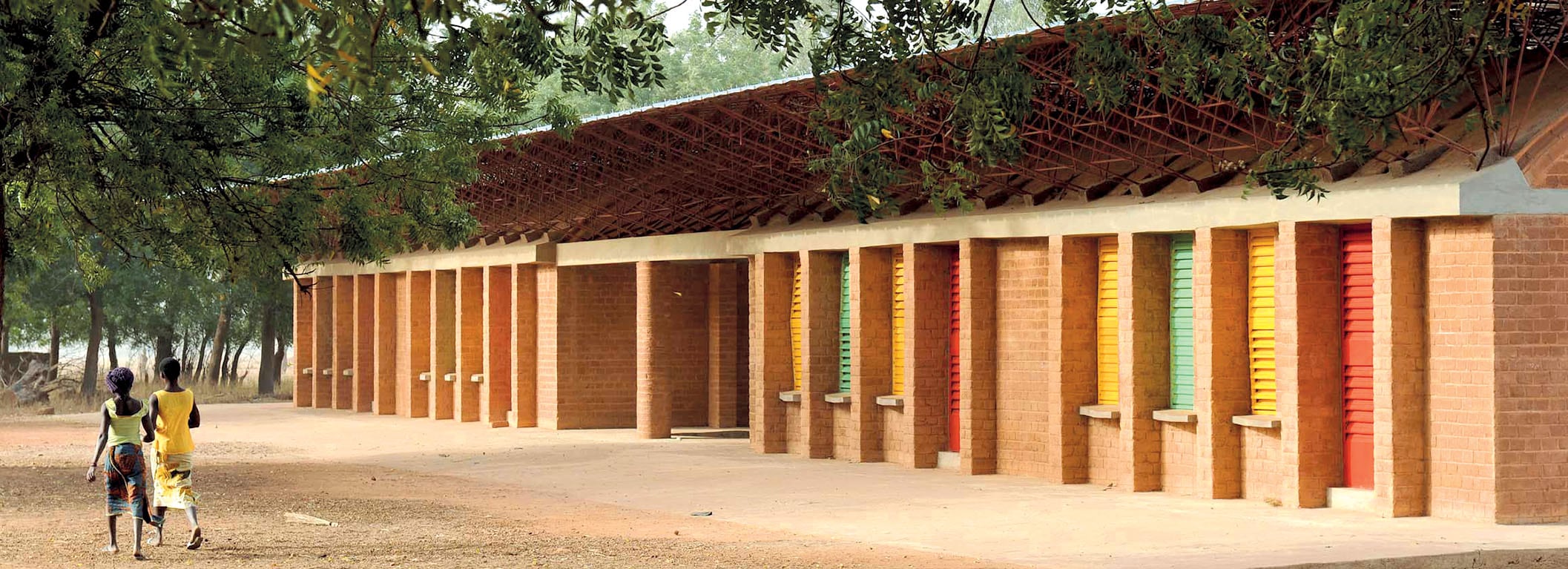
In Pantin, Pierre di Sciullo breathed new colour into the three hectares of façades comprising the Serpentin building, a snake-like block of 550 housing units built by Émile Aillaud between 1956 and 1960. In Burkina Faso, Diébédo Francis Kéré has initiated a lively dialogue between adobe brick built buildings and the iconic colours of the Modern movement, also adopted by Pan-African movements. 7 And so the story continues… ‘Painting in the space-time continuum of the twentieth century allows the artist to bring about his greatest dream’ wrote Theo van Doesburg in 1928, ‘situating Man within painting, rather than in front of it.’ Colour is still an important theme today, but rarely a subject of dispute. Surely all prior theoretical discussions on the question of surface and space have been surpassed?
Agence RVA, architecture, Pierre di Sciullo, graphisme, Pantin, 2013 –2016, DR
©
Diébédo Francis Kéré,
extension de l’école
primaire de Kando,
2008, DR
©
1. Adolphe Loos, Ornement et Crime, 1908
2. La Weissenhofsiedlung est un lotissement de maisons édifié
sous la direction de Mies van der Rohe en 1927 à Stuttgart, par 17 architectes de l’avant-garde européenne. Le succès de cette opération en fit une vitrine internationale pour ce qui allait être connu par la suite sous le terme d’Architecture moderne. Mies van der Rohe avait imposé peu de conditions à ses confrères : les bâtiments devaient seulement présenter une forme cubique couverte par un toit terrasse et être peints de couleurs pâles.
À part deux (celle de Le Corbusier et celle de Bruno Taut), toutes les propositions étaient blanches, et la Weissenhofsiedlung fut qualifiée de « Nouvelle Jerusalem » par des extrémistes antisémites.
3. Henry-Russell Hitchcock, Philip Johnson, Le style international, 1932
4. Le Corbusier, Œuvre complète
5. « J’expliquais comment une nouvelle architecture de ce type devait être colorée et de couleurs pures. […] Ils ont décidé à l’unanimité de prendre cela comme modèle car le problème leur sembla soudain évident :
le Centre Pompidou sera coloré. Ainsi, Beaubourg est devenu ma plus grande a.n.t.i.s.c.u.l.p.t.u.r.e », précise Jean Dewasne dans un texte dont l’original est paraphé par Renzo Piano pour certifier les faits.
6. Patrick Bouchain, Loïc Julienne, Sébastien Eymard et Sophie Ricard (permanence architecturale), rénovation de 60 maisons locatives sociales avec les habitants, Boulogne-sur-Mer, 2013
7. Utilisées tout d’abord par l’empereur d’éthiopie Haïlé Sélassié pour sa propagande de réhabilitation panafricaine elles furent mondialement popularisées par les rastafariens, au premier rang desquels Robert Nesta – dit Bob-Marley. En considérant les couleurs du drapeau burkinabé elles ne sembleraient pas employées de façon si anodines – http://fr.m.wikipedia.org/wiki/Couleurs_panafricaines
How can we help?
F.A.Q.
How can I get a quote?
By contacting the Texaa business representative of your region by telephone or e-mail and leaving your contact details and what you need. We will send you a quote promptly.
How can I order Texaa products?
Our products are manufactured in our workshop and made available to order. Just contact the Texaa business representative of your region. If you already have a quote, you can also contact the person handling your order: the name is at the top left of your quote.
How do I get my products installed?
Joiners and upholsterers are the best skilled to install our products easily. We work regularly with some professionals, who we can recommend. If you have a tradesperson, who you trust, we can support him/her. You can find our installation instructions and tips here.
Got a technical question?
All our technical data sheets are here. Your regional Texaa business representative can also help; please feel free to contact him/her.
Can I have an appointment?
Our business representatives travel every day to installation sites and to see our customers. Please feel free to contact them and suggest the best dates and times for you, preferably by e-mail.
Lead times
Our products are manufactured to order. Our standard manufacturing time is 3 weeks for most of our products. Non-standard products take from 5 weeks. We also perform miracles on a regular basis! Please feel free to contact us.
Who should I call?
To get a quote, a delivery time or technical information, we recommend you call your regional Texaa business representative, who you can find here.
Order tracking
If you need information about your order, please contact the person in charge of handling it: the name is at the top left of your quote.